pen & paper

Evolution of the MB logo

Most brands do not show you this; Showing it is the point — the mark kept changing and kept being itself, and the timeline is the evidence...
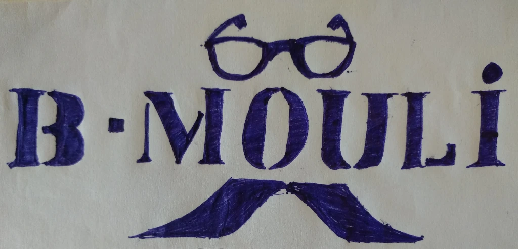
  1. 2018

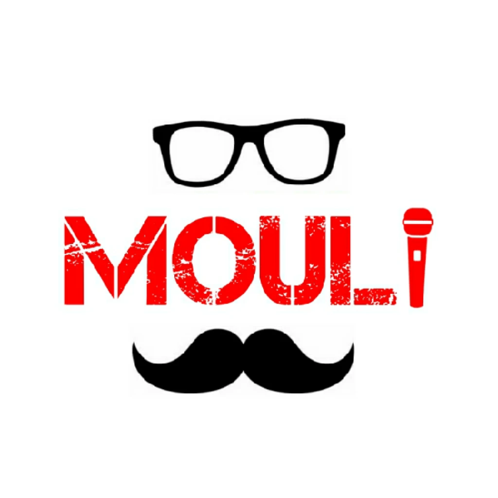
    Literally pen and paper — ballpoint on a cream sheet, then its first digital version; A persona before it was a monogram: glasses, a moustache, a microphone...

    • MB logo, 2018 — first sketchfirst sketch
    • MB logo, 2018 — second passsecond pass
    • MB logo, 2018 — third passthird pass
  2. 2019

    The persona goes circular; Badge lockups, still in colour, still drawing the man rather than the letters...

    • MB logo, 2019 — first directionfirst direction
    • MB logo, 2019 — second directionsecond direction
    • MB logo, 2019 — third directionthird direction
  3. 2020

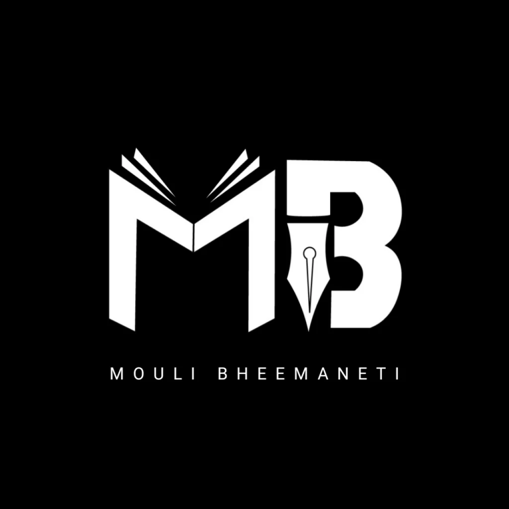
    The face disappears and the letters take over; The M becomes an open book, the B takes a pen nib, and the colour drops away for good; The mark the site still runs on...

    • MB logo, 2020 — the lockupthe lockup
  4. 2022

    Squared off and tightened; Same idea, steadier proportions...

    • MB logo, 2022 — refinementrefinement
  5. 2023

    The same two letters in three scripts — the identity stops picking a language for anyone's convenience...

    • MB logo, 2023 — TeluguTelugu
    • MB logo, 2023 — HindiHindi
    • MB logo, 2023 — EnglishEnglish